WordPress is about to release version 2.5 into the wild (It just hit Release Candidate yesterday so the release date, though officially not known, is coming soon). If you’ve been using WordPress.com or have peeked at the demo site you will know the biggest change coming to WordPress with this release.
You might ask, “Where did WordPress 2.4 go?” The answer to this is that it was skipped. Yes, that’s right, the 120-day release cycle was scrapped this time and you essentially have two releases in one. Again, the changes are vast and countless. This is a huge release.
So let’s get into the nitty gritty shall we?
New Admin User Interface
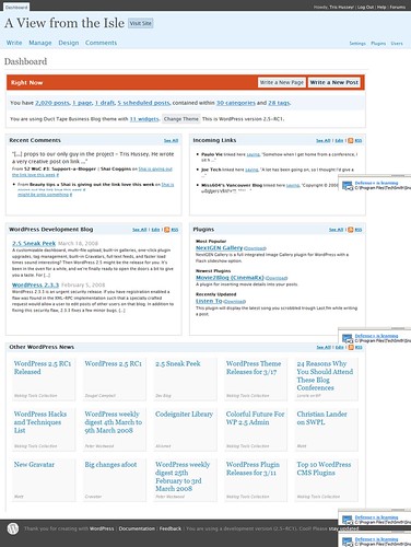 By far the most comprehensive change in this release was the complete rethinking of how WordPressers do their administrative tasks. Happy Cog Studios was enlisted to do usability research and testing – with the emphasis being on usability research. Several of the items in this rundown are going to be broken into their own list item as they deserve their own description and, again, this upgrade is huge.
You’ll notice that the WordPress admin is now bathed in a lighter blue, lighter grey and orange color scheme. I like the nice hues, but others are bound not to. If you’re a developer or know your way around creating WordPress plugins, you can supply your own admin CSS with the
1 | wp_admin_css |
and
1 | wp_admin_css_uri |
filters, and WordPress is already supplying per-user options of “Classic” – the old dark blue feel – and the “Fresh” style which is installed by default.
1 2 3 4 5 6 | function my_admin_css( $cssfilename ) { // Use name of the CSS file inside the wp-admin folder WITHOUT the file extension return ‘my-new-wp-admin’; } apply_filters(‘wp_admin_css’, ‘my_admin_css’); |
I’d just stick with the default though. It’s not too shabby.
Menu Layout
![]()
One of the first things you’ll notice is the change in the administrative navigation. It struck me as very Movable Typeish. I don’t know if the idea came from them or simply that Happy Cog had such thorough user research that it made sense. Either way… it makes sense.
Primarily, users interact with the WordPress admin in one of four areas – writing posts, managing posts, managing comments, and managing design elements. You’ll notice that these items make up the primary navigation on the left side of the screen. (Sidebar: You’ll also notice that the Presentation menu has been renamed Design – which was a usability decision. It makes sense.) Matt wrote more about this.
The rest of the formerly Primary navigation items – Plugins, Options (now Settings) and Users have been moved to a secondary navigation on the right side of the screen.
Sub-navigation is something that’s a little weird. As both the Primary and the new secondary navigation used to be part of the same menu bar, the “submenus” all made sense to appear below the primary navigation. This is still the “right” place, I believe for the new Primary navigation points but seems awkward for the Secondary navigation items that are relegated to a different portion of the screen. I know this is something that is currently being thought about, I just don’t know what the final results will be.
Also, as a bit of additional commentary, I think plugin authors need to go back and revisit their choice of where they have put their plugin subpages. Do they really make sense to be in the Options page (now Settings)? Do they really belong in the Manage page? In my opinion, plugin settings pages should be listed as a sub-page of the Plugins menu.
Widget Handling
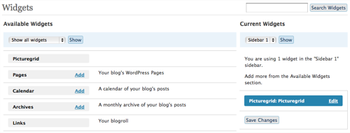
Another MASSIVE shift in philosophy has been in the Widgets page. Before, you could drag and drop widgets into position. You can still reposition widgets by dragging within a sidebar, however, WordPress is relying less on Javascript “bling” for this release. Each widget is listed in a column on the left, you click the Add link and it jumps into the sidebar. Instead of having all sidebars displayed at one time, the user selects the sidebar from a dropdown to expose a different sidebar.
To me, this adds work to the overall experience, and so fundamentally I don’t like it, but it feels more reliable.
Dashboard Overhaul
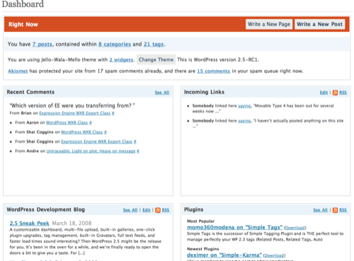
The second thing you will probably notice immediately on login to the WordPress admin (the color scheme being the first) is the new dashboard interface. Now it is completely modularized, and though there is no “tight” way of adding your own, plugin authors can create their own dashboard widgets. The architecture is primitive at this point, but will improve offering a much easier way for plugin authors to do their thing without feeling like they are “hacking”.
A summary of your entire WordPress install is summarized in a widget titled “Right Now” informing you of the number of posts, comments, draft posts, tags and categories. Other useful widgets like incoming posts, etc are available and can be customized with your own RSS feeds.
Visual Editor Improvements
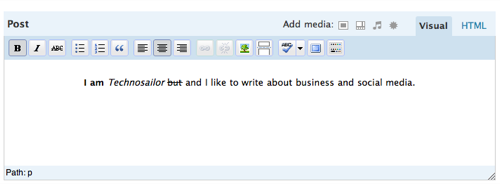
The Visual editor, a long time bane of many users existence, has been upgraded with support for TinyMCE 3. It even includes Full Screen mode for those of you that don’t like to be distracted when writing. I cannot speak to the ability of this upgrade, as I don’t use WordPress’ visual editor, but I’m told it is a vast improvement over the older version. The TinyMCE team has worked closely with WordPress on this release as well.
Flash Uploader
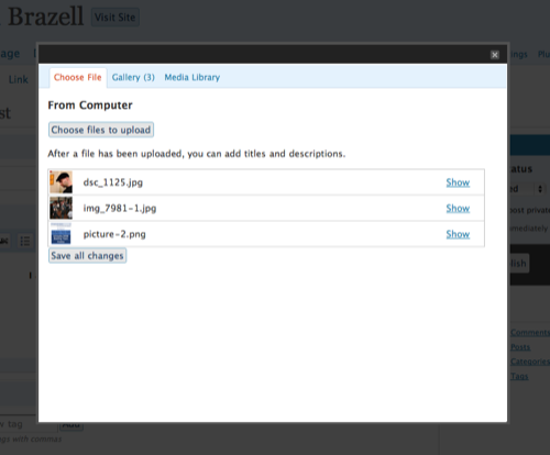
For those of you using a lot of images in your post, the image uploader has been completely overhauled as well. Namely, you can uplopad and insert multiple images at once via a new Flash-based uploader. This will gracefully fallback to the original uploader if Flash is not installed, so never fear. There is now a new “Add Media” link in the header of the post window that handles all this now. For those of you who want to debate the philosophical decision to include closed source Flash into open source, and GPL’ed WordPress, knock yourself out.
Plugin Auto-upgrade
An ambitious new feature that is being included in WordPress is a new autoupgrader. By default, it will try to upgrade plugins that are already in the WordPress plugin repository by writing the new files out to the existing plugins. however, this is an inherent security risk as it would require your plugin files be writable by the world. So the fallback is to upgrade plugins via FTP/FTP over SSL. Though your FTP username and password are stored in your database, it’s important to remember that FTP is inherently insecure. FTP/SSL is much more secure but is still not the best. Thanks to hooks in the filesystem functionality, I’ll be releasing a plugin that I’ve been working on for Secure FTP (FTP over SSH). It’s not ready yet, but hopefully will be soon and I’ll let you know when it is.
Custom Sizes for Thumbnails

Since the image uploader was added back in, something like WordPress 2.0, many, many people have complained about the inability to modify thumbnail sizes. I believe the old default was something like 100×100. In WordPress 2.5, thumb-nailing became a whole lot more useful. You can not only set your thumbnail dimensions globally, you can also have a “medium” sized thumbnail, a la Flickr and an option to crop an oversize image instead of just resizing. I figured some of you would like that.
Tag Management

With the introduction of WordPress tags in WP 2.3, the development group took a measured approach to adding user interface around them. A minimal form field on the post write page allowed for a comma separated list of tags with no additional way of management. Fortunately, in 2.5, a bit more UI was added, though functionally identical. It works like Flickr tags where tags can be added via a list of comma separated tags or via a “type, click, add” mantra. In addition, the UI has a tabbed interface which allows for the selection of tags by checkboxes and by most used tags, useful to say the least.
Password Strength Too

The last major item (and trust me there are tons of smaller items or more obscure items) in the list of things you should know about WordPress 2.5, is the password strength meter. Passwords should be at least three characters or they will be deemed “too short” and should consist of two of three types of characters – letters, numbers or symbols – or will be considered too weak. Password security is a big concern for everyone in IT and blog security itself could be beefed up significantly by users choosing “strong” passwords.
Bonus Item: Timestamp Sanity
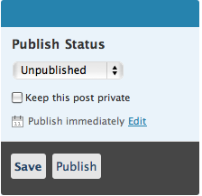 Thanks to Mark Jaquith (Disclaimer: Mark is one of my employees at b5media, but is also a core developer of WordPress), the timestamp functionality of WordPress has recieved a complete overhaul. By default, a new post has no timestamp module. Instead, it’s a publish immediately, or you can click a link if you really do want to modify the timestamp. When editing a post with a timestamp, there is also no “Modify Timestamp” checkbox that caused so much confusion for so many years. If you modify the existing timestamp, it’s assumed that you actually want to change the timestamp! In other words, WP is no longer insulting the intelligence of users (not that it was an intentional insult before, but the big brother protection from the blogger’s own self was a bit tedious).
So if you feel like testing, you can grab a copy of the lastest trunk code at
1 | http://svn.automattic.com/wordpress/trunk |
. The usual disclaimers are in play when using a non-stable released version: No support offered, your mileage may vary, use at your own risk, don’t feed the tigers. But if you want to contribute to the development process, testing AND reporting bugs is a good way. A lot of testing is going on right now before a release, so have at it. :-) Enjoy.
Update: Ozh describes how to create your own wp-admin stylesheet.
