WordPress 3.2 will be released soon (at the time of this writing, it is in RC1 which essentially means it is done and being tested). This is an exciting release as it marks the first release that drops PHP 4 dependency. For years, WordPress has opted to play to the lowest common denominator while hosts have taken their sweet time arriving at PHP 5.
Of course, this may mean nothing to you, depending on your technical knowledge of the underlying language. However, it has limited the amount of innovation that could be possible using the more modern version of PHP 5.
The focus for this release was to slim down redundant code that had been added along the way to employ PHP 5 techniques in a PHP 4-compatible fashion. In addition, a focus was placed on slimming down code all along the way to provide a more efficient codebase. Eliminate, eliminate, eliminate! More Red than Green – a reference to the way changes are recorded visually where red is code elimination and green is code addition.
Regardless, the approach to PHP 5 adoption has had a positive effect. Approximately 12% of the web is powered today by WordPress, whether self-hosted “.org” sites or Automattic’s WordPress.com and other hosted WordPress sites.
As I have done eleven other times before, today I bring you the Ten Things that, in my opinion, you should know about WordPress 3.2.
Twenty-Eleven
One of the big things that was discussed internally around the time when WordPress 3.0 was released over a year ago was the need to keep the default theme fresh. To that end, for WordPress 3.0 did away with the old Kubrick theme and replaced it with the fresh and semantic Twenty-Ten theme.
Yes, you can see how naming a theme Twenty-Ten in 2010 setup the opportunity for a Twenty-Eleven theme in 2011. And there is that opportunity for a new theme called Twenty-Twelve in 2012, but let’s not get too far ahead of ourselves.
Twenty-Eleven visually is not a huge departure from Twenty-Ten. It still uses much of the same visual layout that Twenty-Ten did. The new theme, however, is greatly different behind the scenes.
Note: This blog (along with all of my blogs) are running Twenty-Eleven right now.
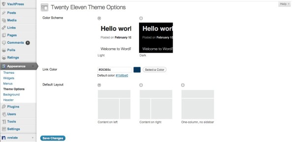
Users of Twenty-Eleven have the opportunity to select a one-column or two column layout for their blog from inside the WordPress Admin. The two column layouts can use a sidebar left or sidebar right variant.
My photoblog uses a one-column format, as an example.
Additionally, Twenty-Eleven also offers a dark and light color scheme. My photoblog, for instance, uses the dark format while this blog uses the light format.
Finally, as with Twenty-Ten, the theme allows for custom header images (or no header images) and backgrounds. Because of the professional nature of this blog, I’ve opted to use no header on this blog and my personal blog utilizes a custom header image.
And of course, as with all things WordPress, no one says you have to settle for what Twenty-Eleven offers out of the box. In fact, it is encouraged that you use Twenty-Eleven as a parent theme that offers all of the benefits of the default theme while putting your own spin on it with a child theme.
Distraction Free Writing
While I write this post, I am using the successor to the Full-screen mode that has been in WordPress for some time. Full screen mode, in my opinion, never really was well adopted but it has been championed in the past by bloggers who focus on efficient workstyles, or Getting Things Done (“GTD”) approach to work.
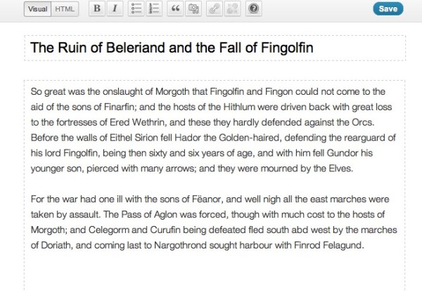

The ability to shut out all distractions so as to focus on the task at hand is hugely important. WordPress core developer Mark Jaquith has said for years that his vision for WordPress was that it would become a tool that got out of the way of people and their writing. It’s not about WordPress. It’s about writing and the experience should be such that you should never have to think about what tool you are using to do that.
With Distraction Free Writing, you have just that. By clicking on the Full Screen (in HTML writing mode) or the new icon for DFW in the toolbar of the visual text editor, the blogger finds themself on a plain off-white canvas with minor tools along the top of the screen to assist in basic formatting. If you leave your hands off the mouse, even these fade away allowing you to just write in a pleasant, serene environment.
This feature is probably my favorite in WordPress 3.2 and usability/writer-facing features are rarely my favorite as a developer. I generally prefer new APIs and developer tools. However, this feature wins hands-down.
Minor Overhaul to Administrative UI
It’s been several years since WordPress has undergone a major Admin overhaul. There have been tweaks along the way, but by and large the administrative interface has stayed true to what it evolved into (with much research and usability testing) in WordPress 2.7.
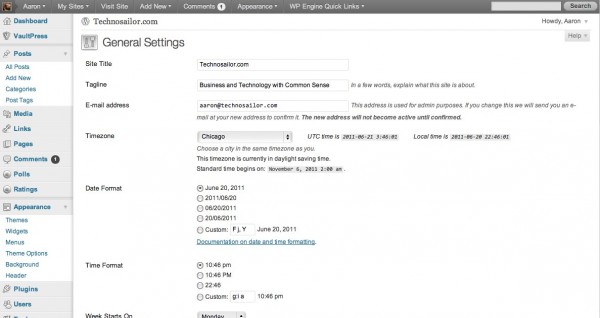
There is not a drastic overhaul in WordPress 3.2, but it is the larger than a few tweaks and color scheme modifications. In WordPress 3.1, the Admin Bar (which I’ll talk about later) came into being and in 3.2, emphasis has been put on placing more commonly accessed functions into it as opposed to the main UI.
As a result, familiar things (which were often used for blogs in Multisite mode) such as the “Favorites Menu” have been removed to the Admin Bar. The Quick Access menu that allowed Multisite Super Admins quick access to the “Network Admin” has been relocated to a less-than-obvious dropdown in the upper right. Hint: The dropdown menu can be accessed by clicking the “Howdy Aaron” link, where “Aaron” is your username.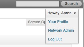
Other aspects of the new interface are mainly aesthetic. Menus are where you’d expect them. Features are where they’ve always been. Plugin developers who have built UI for their plugins are still safe as long as, as usual, they are using the WordPress best-practices, i.e. using the same HTML formats and structures used in core.
More Determined Move to the Admin Bar
As mentioned before, the Admin Bar has become the focus of a “Command Center” approach. By default, quick actions like Adding a new post or editing a page or getting quick access to the dashboard of other Multisite sites are loaded into quick menus in the Admin Bar.
This is also where the philosophy of plugin development that provides quick access to features should be. A good example of this is the Purge Cache functionality in W3 Total Cache. Where this has been in the Favorites menu inside WordPress, it now will have to move to the Admin Bar. This seems like a more natural place to me anyway. Other plugin developers should look at their code to ensure that they are compliant with this approach.
John Brook has a most excellent tutorial on creating and adding menus to the Admin Bar.
PHP 5.2.4 and MySQL 5.0
I mentioned the new system requirements at the beginning of this article. This shift to PHP 5 has been a long time in coming and was done deliberately to time with WordPress hosting on PHP 4 dipping below 10%. In other words, it is more than likely your host is already on PHP 5.2.4+. However, you should verify this if you’re not sure.
With the adoption of PHP 5.2.4, there is also a bump in the requirements for MySQL. Now WordPress requires MySQL 5.0, another hurdle that is not very hard to overcome but should be verified if you’re not sure.
Ryan Duff has created a quick and easy plugin that can be installed to ensure compatibility with WordPress 3.2.
For Newbies, a Better Help Menu on Each Page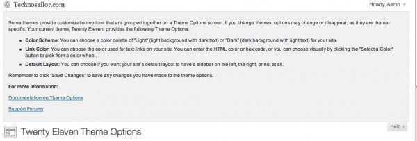
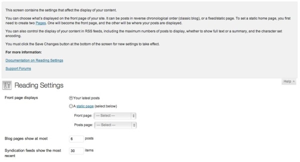
For some time, WordPress has included a contextual “Help” menu in the upper right of many of the screens in the admin interface. However, with WordPress 3.2, every page has a help menu. Not only does every page have a help menu, newbies can get detailed contextual assistance for each page. Veteran users already know their way around, so this will be less than helpful, but for n00bs, the guidance lowers the barrier to entry.
Upgrade Enhancement – Just the code you need!
Think iOS5 but for WordPress. When Steve Jobs announced at WWDC recently that iOS updates would in the future come in smaller packages applying just new code and differences over the air, WordPress was already working on this (errr, except the over the air part).
Up until WordPress 3.2, upgrades were performed by downloading the entire package and applying it over the existing install. While this was fine, it took a lot more time due to the larger package size. This new version will enable future upgrades of WordPress to be done incrementally making the process much faster and efficient.
Code Efficiency enhancements
A huge emphasis was placed on core efficiency in this release. Many of the updates that have gone into this release have been major refactoring of code as well as the removal of legacy (and now unneeded) PHP4 compatibility code.
When I write these articles, I like to look at a diff file of all code changes between the last major release and the current. I was blown away by the amount of PHP4 compatibility code that has been axed.
Additionally, a lot of effort has been placed on database optimization. Many queries have been made more efficient. These things are less notable for smaller sites, but for large sites and hosting companies (such as my company, WP Engine), these types of optimizations add up in orders of magnitude!
File System API
Another optimization that has been made (getting the clue that this release is all about streamlines?) has been in the code that handles upgrades and automatic installs of plugins. When the original code was written, it was written to find what methods were available to write to the filesystem. This was because WordPress does the best it can to be as compatible as possible with as many server configurations as possible.
Some of the more obsolete (and unnecessary) transports have been done away with in favor of Streams. Though streams existed in PHP 4.3 (WordPress’ former system requirement), the upgraded requirement now allows us to do so much more with file transfer, handling and writing.
But I don’t want to get overly technical right now.
No IE6 Support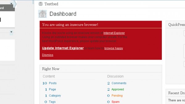
Screenshot courtesy of Mashable.
We all knew Internet Explorer was dead. Well, most of us. Believe it or not, there are still folks (mostly in government and enterprise organizations) where IE6 is still in use. While WordPress has always endeavored to be as compatible with as many configurations as possible, just like file handling replaced by Streams and PHP4 going the way of the Dodo Bird, IE6 can die in a fucking fire too. Oops. Sorry, kids. No more IE6 support.
Automatically approve parent comments
Finally, a longtime nuance has been comment approval. Comments have always been a one-to-one relationship with approval. You approve one comment at a time. And while that’s normally fine, what if you have nested comments and you approve a child comment but not a parent comment? Then you have a weird hierarchy that may not make a lot of sense.
In WordPress 3.2, now when you approve a comment that has an unapproved parent comment, the parent comment will also be approved. Many people have asked for that and now it’s here.
BONUS: Credits Screen
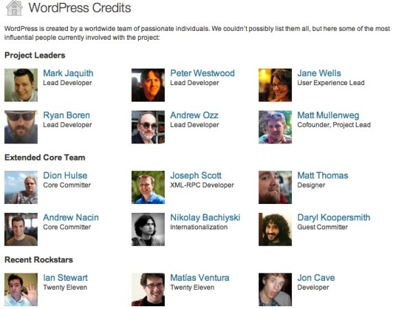
But wait… There’s one more thing. Every release, hundreds of people participate in the development process by writing code, contributing patches, discussing ideas in IRC and on Trac. That doesn’t even begin to acknowledge the testers, translators, and documentation writers who contribute their time free of charge.
Now, in the footer of the WordPress Admin, you’ll find a Credits link that shows everyone who has contributed to this release. Good job, guys! (I’m one of the contributors).
